We must save the file PDF and be <20MB in size! YAY! Mine ended up being wayyy smaller so yay!
- make sure all the images are placed and not missing
- 5mm bleed is to be included
- width = 148mm
- height = 210mm
- delete extra information on the artboard cos it adds to the size
- make sure the links are all there
- file save as > desktop > save > high quality print > check off preserve illustrator editing > view pdf after saving > ALL PRINTERS MARKS > use document bleed setting > SAVE PDF > ok
Tuesday, June 7, 2011
Symbols Symbols

Symbols I used to create the necklace. These were quite easy to create and it was so useful technique for creating the necklace! Thank God someone invented the Symbols Technique in Illustrator =D
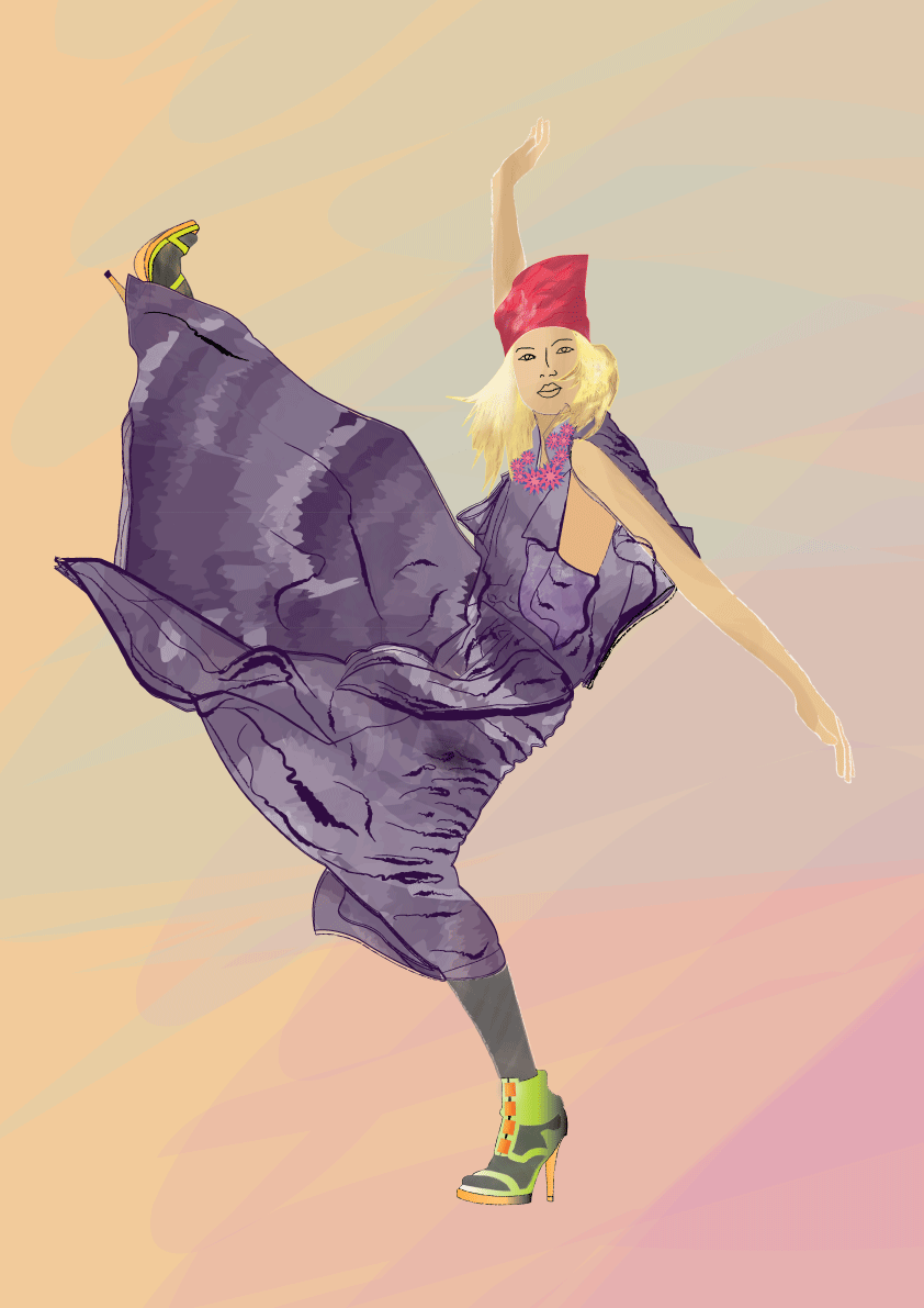
Final Cover Page

So i decided on the jacket/necklace image as my reference for the front cover.
I think this is much more better than my first reference image because I used lots of symbols to create the necklace and I think that the necklace stands out and shows off this technique.
For the face, hair and jacket, I used the pen tool and colour blocked the foundations. I added shadows in and blurred it. I used these techniques because I wanted them to play a part in the background without losing any colours. The blurring technqiue has allowed the eye to be focused on the bolder, solid necklace to be the main feature. I didnt want to include eyes in the illustration because I usually believe that facial featues attract someone's first attention, so having no eyes has challenged the audience to be attracted to something else first.
screenshots of my pages


My layout of the catalogue. I decided I didnt want to overload my background because the symbols on the pages are artworks themselves and I wanted them to be solid, bold and stand out so I didnt want anything in the background to distract it. So I used a pastel green background.
Friday, June 3, 2011
Front Cover Images
I need to find an image that will really show up the symbols technique...tossing up between these two.
I think that the first one is good for a fashion illustration poser etc showing off the figure but I think the second image is more appropriate because the central focus is the necklace. I can apply the technique of symbols to create the necklace feature!
YAY! Better get started now! =D GOOD LUCK EVERYONE!


Creating new symbols and symbol sprayer tool > BACK UP!
4th page
Creating a New Symbol
Creating new symbols in Adobe Illustrator is a particularly useful when there is a need to repeat an art object multiple times, such as creating a piece of jewellery and accessories in fashion illustrations.
New symbols can be created from Illustrator objects, including paths, text objects, raster images, mesh objects and groups of objects. Logos and text as symbols are easy for retrieval for designs who use Illustrator for design layout.
To create a new symbol:
1. Draw the original art object. This can be created using any Illustrator tool and can be as simple or as complex, customised to the preferred style.
2. Group the entire artwork or Select all of the artwork that is included as the symbol.
3. Open the Symbols Palette > Drop down menu > New Symbol > Symbols Options > Name symbol > Type: Graphic
-Alternatively: Drag the object to the Symbols Palette
4. The original drawn art object is now transformed into an instance of the new symbol
5th page/6th page
A spray can in the side tool box represents the symbols sprayer tool. The symbol sprayer tool repeats the symbol and this is an advantage as each symbol is multiplied quickly, without the need to place every symbol individually and precisely. A disadvantage is that once each symbol is sprayed and placed, each instance cannot be selected.
There are eight options that can be used to manipulate the effect and appearance of the symbol instances.
When the symbol tools are selected, a brush circumference will appear. Only the symbols under the brush circumference will be effective.
To adjust the circumference, go to:
Press the { key to reduce size or } key to increase size of the circumference.
1. Symbol Sprayer Tool
This tool sprays and multiples the symbols on the artboard. The rest of the symbol tools are used after they have been sprayed on by using this tool.
To spray symbols:
> Select the Symbol Sprayer tool
> Drag out a symbol
> Click and drag to move the tool around within the symbol set (or boundary box)
If too many instances are sprayed on, hold down the Alt (Windows) or Option (Mac) as you click or drag over the instances that will be deleted.
2. Symbol Shifter Tool
This tool shifts and moves the position of the symbols and their stacking order. It can also be used to create perspective.
Once the symbols have been multiplied using the Symbol Sprayer tool, do not deselect and:
> Select the Symbol Shifter tool
> Click and drag over the instances in the desired direction
> Shift-click on instances to bring them forward
> Alt (Windows) or Options (Mac) and Shift-click on instances to send them backwards
3. Symbol Scruncher Tool
This tool attracts nearby symbol instances to gather closer together and reversely, to move instances away from the cursor.
To scrunch symbol instances:
> Select the Symbol Scruncher tool
> Click and drag over the symbols
> Symbols have come closer together move away from one another
4. Symbol Sizer Tool
This tool allows each symbol to be scaled in size. The longer the cursor is held over the symbol, the larger the symbol. To shrink the size of the symbol, hold down the Alt key (Windows) and the Option key (Mac) and click.
To size symbol instances:
> Select the Symbol Sizer tool
> Click or drag over the instance
> Release the hold once the symbol size is desired
5. Symbol Spinner Tool
This tool rotates individual symbols.
To spin symbol instances:
> Select the Symbol Spinner tool
> Click or drag the tool over the instances
> Rotate the symbols in the desired direction
6. Symbol Stainer Tool
This tool is used to colourise the instances
The longer the cursor is held over the instance, the lighter it will be. Colourising a symbol instance changes the hue towards the tint colour, while preserving the original luminosity.
To stain symbol instances:
> Select the Symbol Stainer tool
> In the Colour palette, select the fill colour that will colourise the instance
> Click or drag instances that wish to be stained
> Hold down the Alt or Option keys as you click or drag to decrease the colourisation amount
> Hold down Shift as you click or drag to keep colourisation amount constant, while gradually changing the colour of the instance to the colourisation colour.
7. Symbol Screen Tool
This tool changes the opacity of the instance and lightens the colours of the instances. The longer the cursor is held over the symbol, the lighter the symbol.
To screen the symbol instances:
> Select the Symbol Screen tool
> Click or drag to increase the symbol’s transparency
> Hold down Alt or Option key as you click or drag to decrease the symbol’s transparency
8. Symbol Styler Tool
This tool allows an application or removal of a graphic style from a symbol instance.
To stylise a symbol instance:
> Select the Symbol Styler Tool
> Open the Graphic Styles from the Window menu
> Select a graphic style
> Click or drag over the symbol instance
The amount of the style applied to the instance increases and the style gradually changes
> Hold down the Alt or Option keys as you click or drag to decrease the style amount
Friday, May 27, 2011
ASSESSMENT 3 ~ GAHHHHH
I've chosen to do SYMBOLS as my technique for discussion. I have never rea
lly used symbols before but I find them really interesting and useful.
I've doing some research on Symbols and also started writing the text for each page. BACK UP!
1ST PAGE
- name of technique
- description of technique
- general about info
- how you can use these tools in fashion specifically
SYMBOL TECHNIQUE
The Symbol Tool is a useful technique used in creating patterns and objects in artworks. A
symbol is a pre-packaged art object. Each time a symbol is used in Illustrator, it is referred to as an Instance because it can be used multiples times throughout an artwork, without any recreation or duplication of the symbol.
An instance of a symbol can be added on individually or “sprayed”. Existing symbols can be edited and adjusted to personal taste and preferences. Creating individual symbols is simple and effective as they can be applied for any purpose.
2ND PAGE
Locating the Symbols Palette
The Symbols Palette contains standard symbols that are stored in the default symbols library.
To open the Symbols Palette go to:
Windows > Symbols
Alternatively, on a default Adobe Illustrator workspace, the Symbols Palette is located on the side tool palette. The Symbols Palettes appears with the Swatches and Brushes Palette once opened.
In Adobe Illustrator, there is a variety of different default (pre-loaded) symbols in the Symbol library. To access these symbols go to:
Window > Symbol Libraries > Select a Library
Your selected Symbol Library will open up in another palette.
Alternatively, if the Symbols Palette is already open go to:
Symbols > Drop down box (on top right hand corner) > Open Symbol Library > Select a Library
3rd PAGE
All the preloaded symbols in Adobe Illustrator can be adjusted and edited. All default symbols are grouped.
Default symbols can be edited by adjusted the colour, including a pattern, and this redefines the original symbol.
To simply edit an existing symbol:
1. Place or drag the symbol instance onto the artwork.
2. Right click on the symbol and break the link.
3. Ungroup the artwork until it cannot be ungrouped.
To ungroup, go to: Window > Ungroup
Alternatively: Click a grouped section of the symbol > Right click > Ungroup
4. All the individual shapes that make up the art object as a symbol has been separated. Each individual shape can be edited by changing the anchor points, filling the shape with a different colour, adding a pattern to the shape and more.
5. Group the artwork.
Note: Breaking the link between the symbol and the symbol instance converts the instance to a regular artwork.
Note: Breaking the link between the symbol and the symbol instance converts the instance to a regular artwork.
Redefining a symbol
Redefining a symbol changes the appearance of the symbol as well as the instances on the artboard. It replaces a default symbol with your updated, edited artwork.
1. Select the artwork that you want to use to redefine an existing symbol.
2. Symbols Palette > Drop down menu > Redefine symbol
Heres a screenshot of my layout and the work I've started to do =)

Tuesday, May 10, 2011
Assessment 3 Complete!
I think that overall, I've created a balance in colours and text. I think I could have improved all three of my posters by experimenting and researching more on the layout of text.
I like the simplistic approach for my posters. I think that none of the posters are screaming for attention and that there is a mellow soft peaceful harmony amongst the three posters as a whole! =)

I'm inspired and motivated to be more adventurous and be challenged for the next assessment.
For the Better
I really enjoyed drawing the hair for this figure. The different brushes and colours really add texture to the hair. For the skirt, I adopted the same technique as how I designed the skirt in FULL BLOOM. I tried to use pastel tones throughout all three of
my posters, but I emphasised the figure in this pos
ter by making the shoes really stark and black and in your face so that the eye can lead you up the poster and emphasising the height of this woman!

Here's my final poster for this theme:

For Fun
I liked the playful and whimsical approach for this poster....and not having to draw a head! Designing this poster brought back childhood memories of going to the Easter Show and Darling Harbour...walking around eating fairy floss, and being able to imagine up the craziest things!
Since the main focus of the figure was not the head, I drew the attention on the dress. Hopefully the dress reminds you of fairy floss, feathers and tulle! I used a lot of brush strokes to create each layer and ruffle and the same shades of purples and pinks that is found in fairy floss and cotton candy!
 Here, I've started illustrating the clouds over the head and its beginning to look like something....
 Here is my final poster! I think my ideas behind this poster are good, but I wish i could have developed this a bit more and experimented with more creative and exciting fonts as well as losing some of the negative space, where the title is.
YUM! COTTON CANDY!!!!!


Full Bloom
I had heaps of fun doing this poster because I liked the concept of a woman blooming from a flower rather than a model being adorned with flowers etc.
Here is just what my blossoming woman looks like:

I caused a lot of different brushes and clipped masks for the different shapes for the petals. Also, I used the blur effect to create the shading.
To keep all three of my posters consistent throughout, I created a very simplistic background made up of a few brushstrokes. I drew attention away from the background and emphasized the figure and I thought that was successful. However, even though they were only a few brushstrokes, the brushes added texture and different shades of the same colour.
I had to play with fonts and layout for the posters and it took a few times before I achieved the ideal poster!

Here is my final poster for "FULL BLOOM":
This is my favourite poster out of all three!

For the Better
For this "For the Better" I took a while finding reference pictures and I came across this one.
Some have approached this theme to be relaxing and casual, but I saw this image to be quite empowering. This photo is taken from a low angle shot, so the emphasis of height is created and I thought that the woman looks quite powerful as the subject of the shot. At the same time, her skirt and the flow in her hair makes her look quite relaxed and comfortable...I kept on listening to The Script's "We Cry" and the lyrics "Mary's ambition/she wanted to be a politician/she'd been dreaming about it since she was a girl/she thought shed be the one who could change the world/always trying to pave the way for women in a man's world" kept on repeating through my head....so I thought it would be better for many women to be able to make a say in this so called "man's world" and the angle and pose of the model in this photo really spoke to me! =)

For Fun ~ Full Bloom
The reference image/poses I have used for my For Fun and Full Bloom posters is a photograph by Nick Knight. I came across this image while doing research for Assessment 1 however, I decided not to use this image because I wanted to explore something different for that Assessment. I have used it for Assessment 2 though!
For Fun:
The figure on the left hand side, I thought was appropriate but it was playful and whimsical.
I liked the idea that it had no head...and the image actually looks like fairy floss! But I wanted to explore the idea of the figure's head being covered up by this wig. There is that saying "feet on the ground, head in the sky" and I like the idea that when our head is in the sky, we are free to imagine and think of crazy fun things! So that is where I started for this poster!
Full Bloom:
The figure on the right hand side is quite elegant and unusual. It appears that the model is wearing a voluminous skirt...maybe upside down. When I saw it, I immediately thought of this model rising out of a flower...and the model itself captures the "full bloom" essence! I used the skirt as a reference and created it to make it look like the model was elegantly and naturally "blooming" out of this flower! Hehehe

Assessment 2 ~ Poster Analysis
For this assessment, we are to design three posters based on these themes:
- For Fun
- Full Bloom
- For the Better
So in class, we began looking and researching on some posters:
- Composition and techniques of the posters are important in creating a visually aesthetic and effective poster
- so remember colour, text, imagery, alignment of text, font etc etc
- For my analysis, I've decided to look at two fashion posters and two typography posters. I have drawn some inspiration from them, however I wanted to gain a wider perspective and understanding on the visual and technical elements for a great poster and hopefully incorporate them into my own work. I really like simplistic and minimalistic posters because I have a greater appreciation of the meanings/symbols behind them as well as an admiration for the designer because they have created a simple but effective poster. That can be very hard because sometimes posters lack elements and make it look really boring and uninteresting!
- "LESS IS MORE!"
- In my Poster Research, I have also collaborated a wider variety of posters that I have found visually appealing and ones that have caught my attention!
TYPOGRAPHY:


FASHION:


Tuesday, March 29, 2011
My chosen illustrators and photographers
I was inspired by watercolour artists and fashion photographers.
Amelie Hegardt
- fashion illustrator
- designs for magazines, designer brands, cosmetic labels
- watercolours, indian inks

Cecilia Lundgren
- industrial designer, illustrator
- black inks, splashes of colour
- layering drawing techniques

Nick Knight
- British fashion photographer
- documentary photographer

Gina Martynova
- graphic artist and illustrator
- watercolours, inks
- coloured outlines rather than black outlines
- illustrative character named Starry


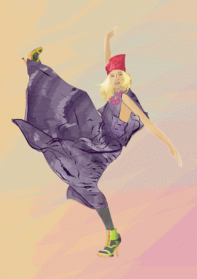
Digital Cover Page
This is my process of creating my concertina cover page:

I outlined a photograph I found on the internet, using the pen tool.

Then I added more lines and traced more details of the dress and figure:

Using various brushes, strokes, and symbols, I was able to create my final cover page illustration:

I outlined a photograph I found on the internet, using the pen tool.

Then I added more lines and traced more details of the dress and figure:

Using various brushes, strokes, and symbols, I was able to create my final cover page illustration:
Subscribe to:
Comments (Atom)